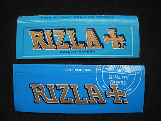
Still working along the theme of commercial / corporate logos, the next to fall prey to my stitch curiosity is the Rizla cigarette paper. I started it last month, thinking: 'I'm fed up with Christmas. Let's do something totally unfestive.'
It took longer than average because of all the solid blue area - yes, that all had to be filled in with adjacent rows of stitches, close enough together to stop the gold showing through underneath, and all in one strand of embroidery cotton (any thicker would have covered ground quicker but been bulkier.) Patience perciveres:
However, in the last I don't know how long, Rizla themselves decided to relaunch the design of all their papers - meaning that the version I've started is technically out of date now. The text slopes the other way, the drop shadow is on entirely the wrong side, and most of all - the precise blue has changed. Gone is that lovely Mediterranean-pool blue to be replaced with something darker and duller (my camera doesn't really do it justice but trust me.) It's strange how you only really notice such things when you've been staring at something for a disproportionately higher than average amount of you time.....


No comments:
Post a Comment